If there’s one thing we love—both in fashion and décor—it’s the ability to mix and match different patterns to give a whole new life to your space (or outfit). You may know the dos and don’ts of print mixing in your wardrobe, but do you know about the ways you should (and shouldn’t) be mixing prints in your home? We’re absolutely smitten with this décor trend, and as with any good trend in interior design, there are a few rules you need to know before diving print-first into your space.
With that said, we’ve put together a list of basic “rules” to employ when adding print and pattern to your space. Of course, each of these rules will vary depending on your personal style and goal for your space, but if you’re a first-time pattern mixer, keep these tips close and you won’t go wrong! Keep reading to learn if you should say “yay” or “nay” to gingham and dots, ikat and stripes, florals and fruit, and more…

1. Balance Bold With Subtle
The key to print mixing is striking a balance between the patterns you choose. Or in other words, don’t stack bold upon bold. If you find a bold pattern you really love—on a sofa, for instance—make sure to balance it with throw pillows printed in a softer, more subtle pattern, so one isn’t competing with the other for attention. On the other hand, if you find a small-scale pattern (like a tiny floral print), pair it with a bold stripe or thick printed gingham for a pleasing contrast.

Image via Caitlin Wilson Design
2. Don’t Let Busy Get the Best of You
Much like Tip #1, this tip has to do with pattern pairings that are placed next to each other, or relatively close by. If your first choice of print is a busy abstract print, or something similar, pair it with something more geometric, simple, or neutral to ground your busy print. A good rule of thumb here is to look for prints with more white space throughout the pattern, then pair it with a more densely printed one. Placing too-busy prints close together can cause a sense of aesthetic chaos, and throw off your carefully curated design.
3. Consider the Atmosphere
Perhaps one of the most important factors to consider when print mixing, is the space itself. Are you designing a kitchen? Bathroom? Bedroom? While bold and colorful prints might work well for a lively space like the kitchen or playroom, it may be smart to choose more calming prints for areas like the bedroom, as well as small spaces like a powder room or hallway.

4. Ground Your Space With Solids
In order for your array of patterns to shine, make sure to set a solid foundation (literally). If you’re print-obsessed like we are, sometimes solids can seem bland. However, choosing solids in colors that appear in your patterns and other pieces of décor will create a harmony throughout the room and let your prints stand out that much more. If you have busy printed pillows, try pairing them with a solid bedspread, or a solid textured rug, to create interest and balance. If you want to keep things interesting, make those solids complementary colors (opposite on the color wheel) to your prints, so that the look stays fresh rather than stuffy.
.jpg-EwGsstw?ixlib=rails-2.1.3)
5. Pick Your Patterned Pieces
Not only do you have to mind the actual patterns you’re choosing for your space, but you should also be paying special attention to which furniture or décor pieces you’ll be applying those prints to. If you’re dying to put up that wildly printed wallpaper you’ve had your eye on, it may be smart to leave the rest of the patterns in your space to accent pieces, rather than large pieces of furniture. On the other hand, if the only prints you have in your space are only on a couple of accents, it would do your space well to add a boldly printed accent chair or sofa to make your pattern mixing look more intentional.

6. Coordinate, Don’t Copy
To keep your space looking natural and effortless, try to avoid copy-cat patterns on different pieces. Instead, choose patterns that are similar in style or employ the same color scheme, but aren’t exactly the same. This will keep your space looking like you weren’t trying too hard, but instead just have a natural knack for pattern mixing. (Fake it ‘til you make it, right?)
7. Keep Things Odd… Numbered
When in doubt, do everything in threes! Even numbers in design tend to look “off,” unless you’re intentionally going for a very geometric or symmetrical design. So, when mixing prints in your space, choose at least three patterns, and disperse them throughout the room. If your room can handle more, add from there so that you have an odd number of patterns decorating your space. Remember that effortless quality we talked about in Tip #6? This trick helps with that “you’re a natural” look, too.

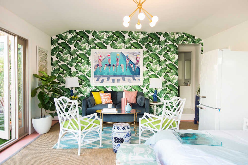
Image via Oh Joy!
8. Keep Color Consistent
Last, but certainly not least, don’t forget to keep your color scheme consistent throughout your space. Even if your prints don’t necessarily match each other, make sure you’re pulling your colors from artwork in the room, or another piece of décor that ties everything together. Pulling colors from one pattern into another creates a theme throughout your design, and automatically makes the eye believe that each piece goes together, even if they are totally contrasting patterns.
Did you learn anything new about print mixing from these tips? What other tips would you add to this list?
We can’t get enough of this trend, and urge you to try it at home! It’s endless fun, to say the least, and the best part is you can keep it ever-changing just by adding or swapping out different prints.
Now, go print mix to your heart’s content!
Xx Team GM