Hi Everyone,
I am so excited to give you the full tour of our brand new Lake Michigan home. I hope you areinspired bythis before/after transformation, and can take advantage of our biggest sale of the summer happening right now offering 30% off all beach aerial photography including framing.
If you’ve been following along, which I hope you all have been, then you probably saw this sneak peekand maybe even read this post from our Interior Designer Kate Lester where she gave you a behind-the-scenes look at the inspiration behind our design and decor choices. For those of you who didn’t know, Jeff and I, along with Kate, rennovateda 104 year old home on Lake Michigan otherwise known as “Rainbow Ridge Reno”. In this introductory post, you can get a better idea of our connection to Lake Michigan as well as the history of the home we’ve been working on.
Before we get started, I thought it would be helpful for us to take a look back at what the house was before and see how it looks today.

You may remember from an earlier renovation update that one of the most obvious structural changes we made was changing the pitch of the roof. We changed the direction that the roof faces and also raised it quite a bit. This turned out to be a great idea because it gave the whole house much higher ceilings and allowed for a lot more natural light to flow throughout the space. We also moved the deck to the front of the house, which makes a huge difference in terms of connecting with the community.


Now, it’s time for the big reveal... I hope you all love the end result as much as Jeff and I do!
Entryway and Sunroom
As a coloful welcome to our home, the entryway features this nautical and beachy print The Reef, Bora Bora to give a bright and warm entrance.
Adjacent to the entryway is the big bright sunroom. The dark wood accents in the coffee tables and end table from All Modern center the room and the hanging shade from Circa Lighting really draws attention to the height of the room. Our off-white couches from Kate Lester Home help to keep the space cozy and comfortable without feeling overwhelmed.

Our choice of ultra-light sage green paint from Farrow & Ball was intentional to bring the beauty of the natural greenery from outdoors inside. Similarly, we included some faux foliage from All Modern in the corner to really connect the space to the surrounding nature. The sunroom is also the only addition we made outside of the original footprint of the house. This was a great decision because we love having this extra space to entertain and relax!
Kitchen
You wouldn’t believe it by looking at it now, but our new kitchen actually used to be a screened in porch. You can see the original space and the new one in the photos below. I’m actually standing in the exact same spot in both photos. Quite the transformation right? The old kitchen became our master bedroom and this move allowed us to join the new kitchen with our living room, dining room, and bar to create one large entertaining space.

I love how bright and airy the kitchen feels—both thanks to the crisp white paint and the natural light flooding in. To us, the kitchen is one of the main focal points of the house because people tend to congregate there when they come over, so we wanted it to feel very inviting. Painting the island navy was definitely a bold choice, but I love how it pops against the otherwise white kitchen and makes the navy detailing in our bar stools really stand out. The print Aquinnah Kayaker, Martha's Vineyardin the center of the kitchen brings a lovely contrast ito thenavy detailing. The light fixtures above the island from Circa Lighting help incorporate the dark tone into the rest of the space and the brass detailing ties in with the brass hardware from Emtek used throughout the room. Love is in the details, right?
Bar and Dining Room
To say I’m obsessed with the Starburst tile from Fireclay on our bar is an understatement. It’s just so fun and really catches the eye. If you notice, our bar doesn't have any bottles displayed on it. This was possible because of the extra deep drawers we designed to store the bottles standing up below the bar. It’s nice because it keeps everything looking clean and tidy. We also used the same hardware from Emtek on our bar as we used in our kitchen to create a feeling of consistency and to coordinate with our light fixtures from Circa Lighting.


It was important for us to have lots of space for entertaining. Something unique about our dining room table is that it has two leaves so it can open up to seat 14 people. Perfect for when we want to host a summer bbq with our friends and family. I love the beachy pops of color that the print Bondi Beach Vertical, Sydneybrings to the room. And isn’t that chandelier from Circa Lighting a show stopper?The shape feels so unique and although it’s pretty minimalistic in its design it still really makes an impact.
Since we didn't want guests to have to choose a space to hang out in, we connected the kitchen, bar, dining, and living rooms as one large space so everyone can always be together. By sticking to a similar color palette throughout the space we were able to make the flow feel very natural. So, although it technically has four different uses, it’s connected in one big space.
Living Room
The living room turned out to be such an incredible space and a huge transformation from how it started. In the two images below, we are actually standing in the exact same spot. It looks like a completely different space, right?

Since I anticipate our family and friends spending a lot of time in here it was important that it felt cozy and livable, but still sophisticated.
Our sofa and chairs from Lee Industries helped accomplish that by looking crisp without having to sacrifice comfort. The waterfall detailing on our fireplace and the shiplap walls are so special and really add great dimension to the room. If you look closely, you’ll notice that the shiplap carries over into the ceiling, which draws the eye up and puts an emphasis on the height of the room. I also love the nautical vibe theGrand Saline Beach, St.Barths II brings to the whole room.Considering how low the ceilings were originally, this is especially exciting. I can’t thank Kate Lester enough for helping us come up with the design for this space.
Something you’ll notice throughout many of the rooms in our home is that we mixed and matched neutral tones with colors that complimented them well and weren’t overwhelming. The perfect example of this is our child-friendly coffee table ottoman in front of our couch, which we recovered in a beautiful blue fabric from Peter Dunham Textiles. The blue added a fun bit of color to the room that wasn’t distracting from the rest of the space.
This bright red backgammon table has been with us since our first home and is a happy splash of color in our living room. I especially love how it makes the bright colors ofin Torrey Pines Beachpop out of the print. I chose this print for our living room because to me it captures the quintessential summer beach vibe. Although it’s in San Diego,It just goes to show that it’s perfect for any beach home regardless of where it is.
Master Bedroom and Bathroom
As I mentioned before, our master bedroom was actually the kitchen of the original house.

When it came to our bedroom, we wanted to create a space that feels peaceful and relaxing. The detail of the shiplap walls made the space feel very beachy, which pairedperfectly with the print, Bronte Baths, Sydney over the bed, and really helped us blend our California style with the laid-back personality of Lake Michigan. With all the natural light we get in our bedroom, finding the right window treatments was extremely important. We used fabric from Clay McLaurin to create stylish shades that easily go down to block out the light. I also particularly love the leather chair from Lee Industries that gives a nice masculine touch to this space.


We put so many fun details in our master bathroom that made the space amazing. For starters, the Fireclay Tile on the floor and shower walls added a fun mix of patterns. We also consistently used brass hardware everywhere in the space from the handles on our shower door and cabinets to the mirrors and light fixtures. The mirrors are from All Modern and look so good next to the beautiful wall lights from Circa Lighting. Our brass drawer pulls and knobs are from Emtek and have the most beautiful satin finish that makes them both subtle and sophisticated.
Nursery and Kids’ Bathroom
If you haven’t noticed by now, peace and serenity are major themes for this home and our nursery design is no exception. This is most obvious in the color palette, which blends cool pastel tones that make the room feel like an oasis. The wallpaper from Farrow and Ball is just so sweet and made the perfect backdrop for the rest of the space. I also love how the light green curtains tie in the green from the leaves outside the window. Our choice to use images from my Poolside series in the kids’ room was a nice nod to all the swimming we’ll be doing during our summers here. The sisal area rug from All Modern really made the room feel extra cozy.


I love this little nook in the kid’s room and can’t wait to sit here and read books to the twins. This pillow from my collaboration with Cloth & Co. adds a playful touch to the room and ties in with some of the other animal accessories, like this giraffe lamp from All Modern on the dresser.
Designing a bathroom for the kids was particularly fun. We really tried to focus on creating a space that would grow with them over the years, which meant nothing too childish. We used a bold custom color tile pattern from Fireclay Tile for the floors to really make an impression right when you step inside. I also love the light fixtures from Kate LesterHome. The jumbo bulbs are unique and much more fun than boring old LED lights.
Guest Bedroom 1
This room is honestly one of my favorites in the house. I just love how it turned out and there was a lot of thought and intention behind the details. For starters, The original space had one beam across the ceiling that was weight-bearing. Take a look at the before photo below to see what we were starting with.

Crazy, right? For symmetry’s sake, we added a second beam to highlight the division of the room. I chose to use prints from Big Sur and Pebble Beachbecause I wanted the room to feel elevated as if you’re in the bunk room of a beach club. The feather wallpaper was such a fun touch and I love how the warm tones of the beachy beds stand out against the cool blue. Thebenches from All Modern at the end of each bed tied nicely to the headboards while also being functional. This way each guest has a place to lay some of their belongings, sit down while putting on their shoes or getting ready.
.jpg-Ztcc9yU)
Guest Bathroom
Our guest bathroom was uniquely designed to be just as beautiful as it is functional. Since there is only one bathroom downstairs, I wanted the space to be able to be used by multiple people at one time. The toilet area is closed off by a door and the shower has a changing area that is closed off by a curtain. That way multiple guests could be using the bathroom, brushing their teeth, and taking a shower all at the same time. Another beautiful detail is the tiling from Bedrosians on the floor which spreads all the way across and into the shower. As you can see, we played around with a lot of different fun tile options in so many rooms in the house. We went with black hardware from Emtek in this bathroom so as not to conflict with the black and white pattern in the tile. The matte black border on ourAll Modern mirrors look great with the steel pendant lights and the rest of the hardware.
Guest Bedroom 2
For the second guest bedroom, we used a technique where the color only goes up the wall three-quarters of the way and then transitions to a white paint that matches the ceiling. This is supposed to make the room feel taller than it actually is. The beds in this room were left behind when we bought the house and we chose to keep them to help us honor the history of the home and the community. We placed two similar colored prints above each bed, Castle Hill Lawn, and Dunes Club, Narragansett. The light fixture from All Modernhas a retro vibe that complements the antique beds so perfectly. We tied in the black from the light with a beautiful black nightstand also fromAll Modern.
I love the way this room turned out to be so different from the other guest room. Which one would you like to stay in?
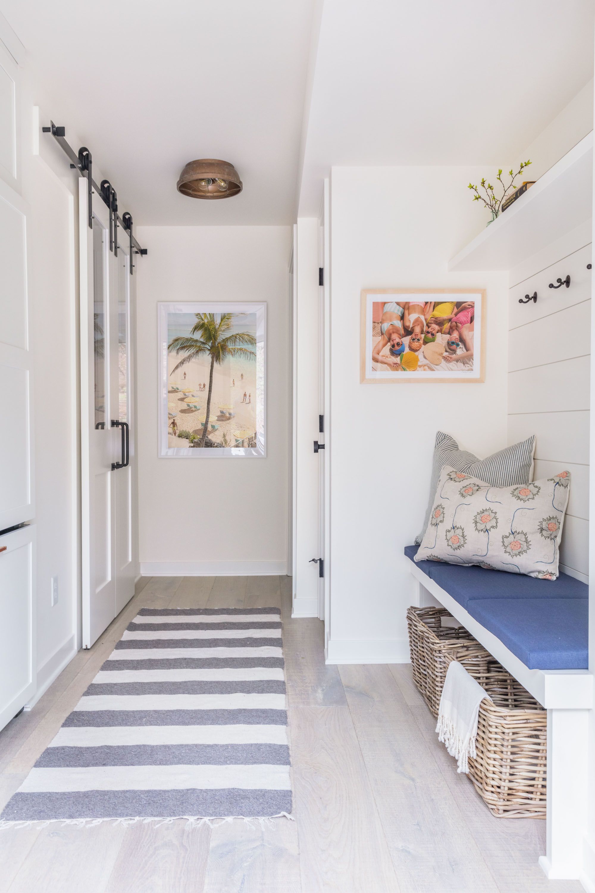
Mudroom and Laundry Room
When designing our Mudroom and Laundry Room areas, we really had to get creative to make the most of the narrow space. One trick we used was concealing the laundry room behind barn doors. These sliding doors were perfect because we were able to close off the space without worrying about anything blocking off the hallway. We also added in a concealed refrigerator behind the cabinets in the wall.
I always get excited for an opportunity to decorate with my wallpaper collection and this laundry room was no exception. From far away it looks like an intricate pattern, but when you look up close you realize it’s one of my beach prints! Fun, right?

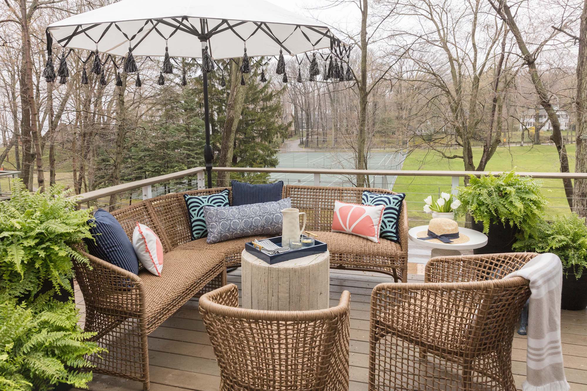
Patio
Originally, the deck was on the back of the house, but we decided that having it at the front would help us better connect to the community. The space is pretty small so it was important that we maximized every inch as much as possible. Thanks to Frontgate’s collection of furniture for small spaces and extensive selection of outdoor decor accessories, we were able to fit a lot of seating into a tiny area and design a space that’s beautiful. It’s going to be perfect on warm summer days to enjoy fresh lemonade with the kids when they get older and cocktails with our friends.

Before I finish, I just wanted to take a moment to thank our builder, Troxel Homes and our designer, Kate Lester for helping us bring our vision to life. So much of this could not have been possible without their creativity and motivation to get things done. Fixing up an old home is a lot of work and it takes a great team to get it accomplished!
I hope you all love how it turned out as much as we do. I can’t wait to take the kids there this summer and entertain our friends and family in the years to come. I know this is going to be such a special home for my family and I to spend time together and make amazing memories.
Cheers,
xx
Gray
Photos: Gray Malin, @graymalinpersonal on Instagram
Brand Partners:
Circa Lighting, Fireclay Tile, Lee Industries, All Modern, Kate LesterHome, Bedrosians, Emtek, Zephyr, Peter Dunham Textiles, Farrow & Ball, and Frontgate.