We can’t believe the month of January is already half over, but we’re not getting too discouraged that time is passing by just yet. There’s still so much of 2019 to look forward to, and one of the things we’re most excited to see this year is what décor trends emerge and take the top spot in our ranks—and which ones fall to the bottom of our list. We reached out to our expert interior design contributors to look into their design crystal ball for us, and per usual, they delivered a handful of décor trends that we can’t wait to try in 2019. So without further ado, here are the 2019 décor trends that will most definitely be IN… and the trends you should break up with this year and leave in the past.
What’s Out: Painted Feature Walls
“Say goodbye to painted feature walls. Instead, commit to painting the full room instead of playing it safe with just one wall.Not only will the results be far more dramatic, but it will feel much more luxurious.” – Gillian Segal, Gillian Segal Design
.jpg-h8EkGGA)

What’s In: Plaster
“Plaster, plaster and more plaster! Be prepared to see this throwback texture make a comeback. Fireplace surrounds, hood fans in kitchens, or even in lieu of a wallpaper. I am a huge sucker for this trend and think plaster can add beautiful depth and texture to any space.”– Gillian Segal, Gillian Segal Design
What’s Out: Chrome Finishes
“I constantly preach that mixing finishes and metals is a must, so we are very happy to say goodbye to the chrome-overloaded bathroom and kitchen. Have fun and mix up the hardware and light fixtures—it adds depth and dimension!” – Kate Lester, Kate Lester Interiors
What’s In: Deep, Moody Hues
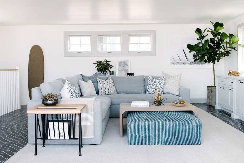
“Another trend we are really excited about are the deeper, moodier hues when it comes to paneling, windows, and cabinetry. We are steering away from the ‘safer,’ pastel tones, and diving into these colors that have a bit more edge to them. (I’m looking at you Cavernous by Dunn Edwards!) The contrast is dramatic, and while some might worry about these types of deeper colors feeling dark or heavy, it’s actually the opposite. The look is really fresh and chic!” – Kate Lester, Kate Lester Interiors

Photo by Andrea Domjan Photography
What’s Out: Too Much Terrazzo
“This will be controversial, because most people will say it’s a BIG in... but I’m concerned about terrazzo overload! Unless you can do it like Sarah Sherman Samuel (in Mandy Moore’s houseand most likely her own new home)... beware of this trend that seems like it is taking off too quickly! Will you LOVE it 10 years from now?” – Dee Murphy, Murphy Deesign
What’s In: Brazilian Inspired Furniture
“Here’s what will be in: sunken living rooms and a continued love for big, cushy, vintage Brazilian furniture from designers like Alessandro Becchi and Percival Lafer.Everyone loves cozy, lived-in spaces, and these designers give it to us in spades... and with major (cool Brazilian) style!” – Dee Murphy, Murphy Deesign
What’s Out: Too Many Neutrals
“With the onset of bold florals and overall strong jewel tone colors emerging in interior design, neutral design schemes are taking a big backseat.Going for a neutral palette in todays color embrace will be more reminiscent of design trends of the past. Having said that, what’s always in is putting the pieces and colors you love in your home; that’s never a wrong decision.” – Prudence Bailey, Prudence Home + Design
What’s In: Florals & Toile
“One of the most refreshing trends we are seeing is the resurgence of florals and toile!Whether we see bold florals or toile on the walls or in drapery and upholstery, it is back and most likely here to stay.Bold florals give you a lot of color and drama and are so easy to incorporate into any design scheme. I love mixing the glamour and romance of florals with animal prints and furnishings that are more modern or rustic.The friction it causes can bring electricity to a room.” – Prudence Bailey, Prudence Home + Design

What’s Out: Grey Walls & White Trim
“I don’t know if I really believe in things being ‘out’ since sometimes I am like ‘OMG I hate glass tile,’ and then a company comes out with a reverse painted glass tile that is amazing, but I think as a designer you tire of a certain trend if you see it is overused. I am absolutely ready to never see grey walls and white trim again, like ever.” – Kate Lester, Kate Lester Interiors
What’s In: Browns (Yes, Really!)
“Brown is back in a big way! (No I am not joking.) We are really gravitating toward neutral tones in our tile and fabric selections this year. Natural wood tones are also still going strong in many of our design concepts, as are hints of matte metals, and hues like burnt orange, and deep blue. The key to keeping these ‘new neutrals’ from feeling dated is all about introducing a crisp white into the palette for contrast. Our favorite is Simply White by Benjamin Moore.” – Kate Lester, Kate Lester Interiors

Photo by Andrea Domjan Photography
Are you going to ditch any of these trends and adopt our designers’ fresh ideas?
If you ask us, we’re most excited about florals, toile, and plenty of color… So cheers to a year of exciting design!
Xx Team GM
Photos: (Header) Kate Lester Interiors, 2.-3. Gillian Segal Design, 4. Andrea Domjan Photography, 5. Prudence Home + Design, 6. Andrea Domjan Photography