When it comes to decorating our walls, our motto is the more the merrier. Okay, we’ll admit that some walls seem like they were made for that one oversized print, but if we can swing it, we’re always game to add more artwork to our walls. If you need to fill an especially expansive wall space, you really can’t go wrong with a diptych or triptych, but believe it or not, that’s not our topic of conversation today. Our President’s Day sale is happening as we speak (or, write…), meaning the more you buy, the more you save! So why not fill those walls with a few prints you can’t resist? If you need a starting point—and some styling inspo—then look no further. These are the series that look best displayed in sets of three (or more)…
Gray Malin at the Coral Casino
We love these prints solo, but when displayed together they bring out the strengths of one another and create the dreamiest pastel color palette we can imagine. If you don’t have room to pack them all on one wall, try mirroring them around a corner like we did in the studio. Pro Tip: When combining prints from the same series, try playing with horizontal and vertical orientations to mix things up and keep your walls from feeling too “cookie-cutter.”
Pictured Left to Right: Coral Casino Beach & Cabana Club | Diving Instructor | Lounging Ladies
To shop all prints from Gray Malin at the Coral Casino, click here.
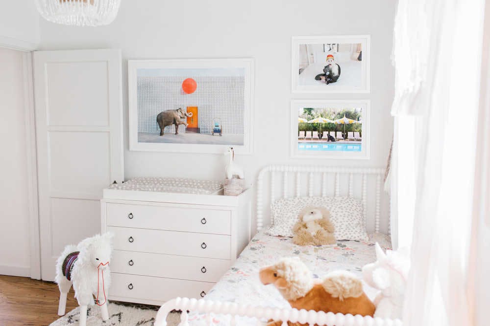
Gray Malin at the Parker

Gray Malin at the Parker is equally chic in nurseries and adult rooms of the house, and we will forever love mixing and matching prints from this collection. (P.S. This gender-neutral nursery is the perfect backdrop for the animals roaming the grounds of the Parker, don’t you think?) No matter the room, you can create a focal point even when mixing prints from the same series, simply by varying your scale. For instance, hang a medium or large print over a part of the room you want to emphasize (like a dresser, couch, or bed), and accent with smaller prints hung together.
Pictured Left to Right: Red Balloon II | Cartoons in Bed | Cabana Boy I
To shop all prints from Gray Malin at the Parker, click here.
Bon Voyage

If you’re not familiar with Gray’s Bon Voyage series, let us give you a bit of background. Gray conceptualized this series as a first-class journey with timeless cultural icons—all told through an airplane window. Any of these icons are striking on their own, but what better way to display them than in an arrangement similar to actual airplane seats? If you ask us, hanging these prints in a row brings the series to life in an unforgettable way. (Sidenote: Calling all lovers of symmetry… you’ll love these prints hung in a set.)
Pictured Left to Right: The Glamour Girl | The First Lady | The Pop Artist
To shop all prints from Bon Voyage, click here.
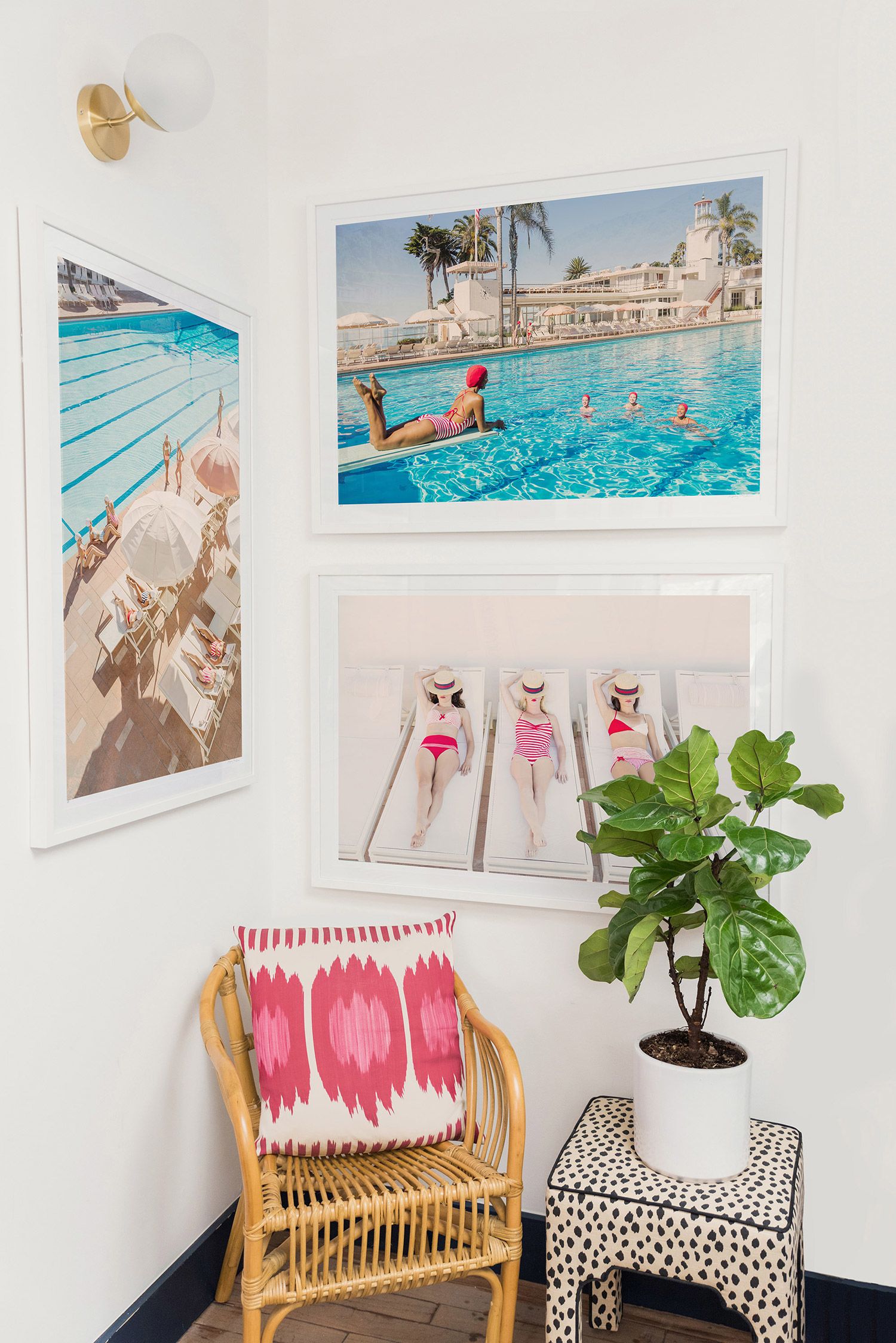
Gray Malin at the Beverly Hills Hotel

The obsession with our Beverly Hills Hotel collection is real over here, so we will gladly jump at any chance we get to hang more prints from this series. Pair four coordinating prints from the collection for a cohesive look that brightens up a little nook. Pro Tip: When displaying multiple prints from the same series, coordinate colors between each print for a look that is cohesive and interesting. And for bonus points? Vary subjects and scenery to avoid a look that is too repetitive.
Pictured Top Left to Bottom Right: The Beverly Hills Hotel | The Touch-Up, Beverly Hills Hotel | Lounging Ladies, Beverly Hills Hotel | California Girl, Beverly Hills Hotel
To shop all prints from Gray Malin at the Beverly Hills Hotel, click here.
Which prints would you mix and match?
There’s no right or wrong way to do it, so head over to the shop to explore, and make sure to scoop up your favorite pairings before our President’s Day sale ends…
Xx Team GM
Photos: GrayMalin.com