Interiors
Tips & Tricks: How to Use Color in Interior Design (Even If You’re Scared of It!)
byTeam GM
5 years ago
Using color in interior design can feel a lot like committing to a serious relationship—it’s exciting, a whole lot of fun, and yes, a little bit scary. But after today, we’re confident you’ll look at colorful interior design in a whole new light, and will be more ready than ever to take the plunge. Our expert contributor Gillian Segal of Gillian Segal Design is sharing her tips on how to use color in interior design with us below. But not just that… she’s talking to all of you out there who might feel a little bit (okay, a LOT) intimidated by the idea of using color in your space. But we’ll let her dish about the details…

Interior design is a way to bring beauty into peoples lives, a form of self-expression, a way to say something about who you are… which is why I love what I do so frickin’ much! Currently, what my house says about me is that I’m a tired mom—our living room is a sea of Fisher-Price primary colors that I promised myself I would never succumb to. That interior design infraction aside, color is such an important element in any space. Especially during the dreary winter months, color is a great way to inject instant depth and personality. That being said, when it comes to working with my clients, I find many of them start to shy away from committing to color and opt for a neutral palette instead. If you are wanting to work with more color in your space, don’t be scared! It’s time to banish the beige, and here’s how:
1. PAINT
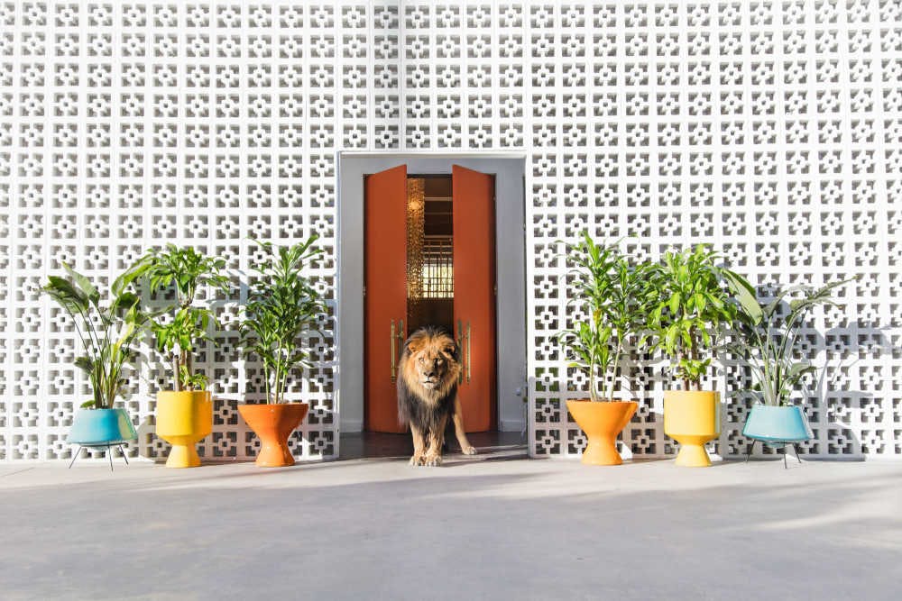
You may be thinking, Thank you for that groundbreaking statement, Captain Obvious, but paint really is one of the most cost-effective and dramatic ways to change a space. I always remind my clients that nothing in décor is a life sentence—if you want to change the color of your room in two years, you can do it yourself over a weekend if you really want to. I am a big fan of committing to a whole room (as opposed to a feature wall). To avoid ceilings from feeling too stark against colorful walls, we often use a half-strength version of the wall color selected to give the ceiling a soft and airy feel that seamlessly flows into the walls. If you’re not sure what colors work well together, find a piece of art with a palette that speaks to you and works with the tones in there.

2. LAYER YOUR HUES
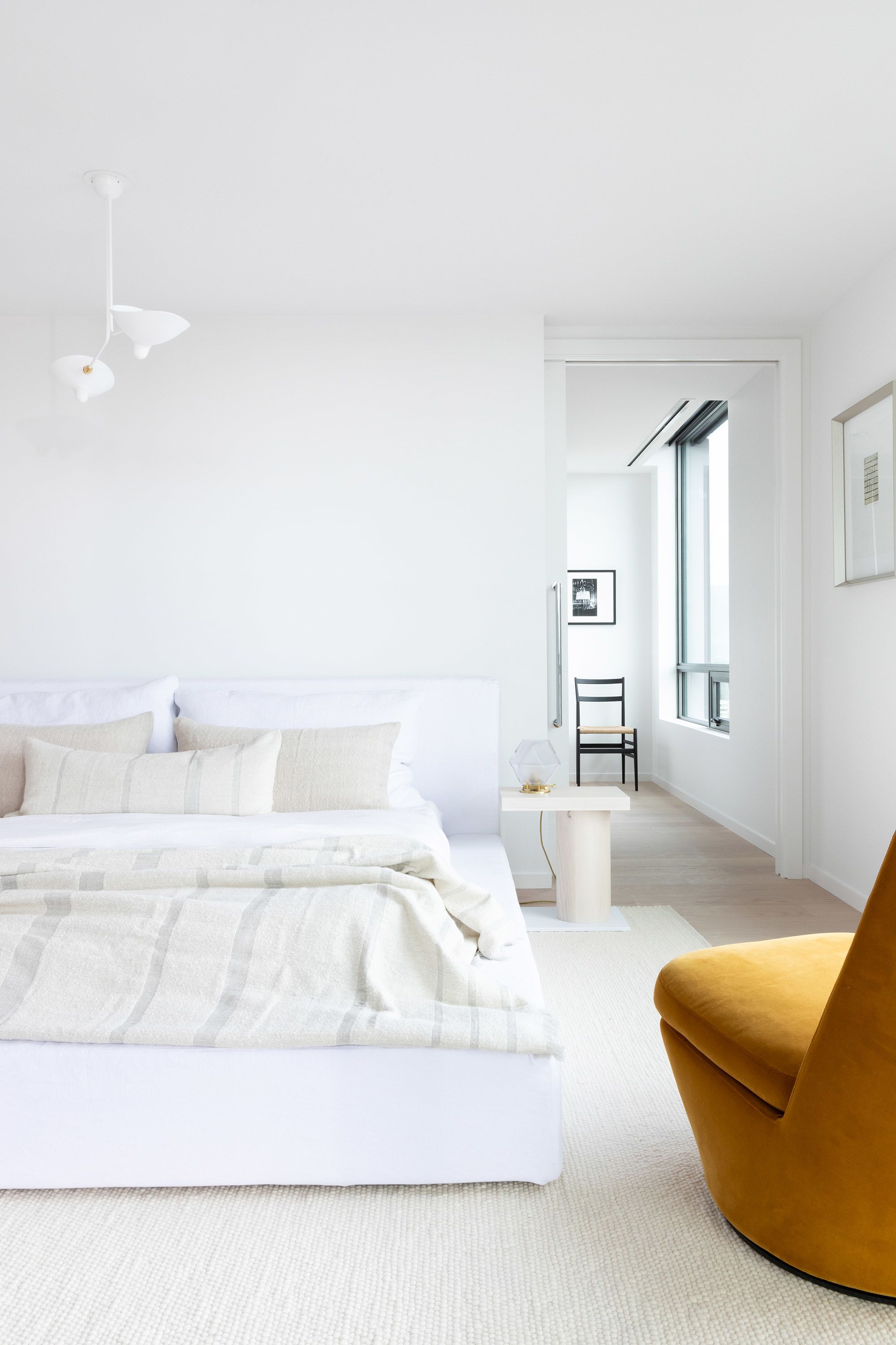
If playing color mix-master is too overwhelming for you, work with a more monochromatic scheme. Select one color that speaks to you and play with different hues to create a layered and thoughtful look. In this bedroom, we selected a Yale blue for the walls, added indigo highlights, a steel blue pillow and robin egg blue striped through the blanket.

3. POP OF COLOR
You would think when some clients are debating purchasing upholstery in a bold color they are considering a marriage proposal—but remember it’s not all that hard to break up with an armchair if turns out not to be a lifelong match. So, if you are feeling really nervous but want to dip your toe in the colorful water, opt for a pop of color. Work with a neutral scheme and add in a statement piece (an armchair, an area rug or great piece of art). With a minor commitment and high impact—this one is a no-brainer.
![]()
Easy as one, two, three!
We have a whole new relationship with color after reading this, and we hope you do too. Need to take things slow? Try starting with an art print or two… ;) Head to the GM shop by clicking here.
Xx Team GM
Photos: Gray Malin, Gillian Segal Design,Ema Peter Photography