
Interiors
Tips & Tricks: How To Pull Off Pantone’s Summer Color Trends in Your Home
byTeam GM
5 years ago
From bold Pink Peacock to pops of Aspen Gold, we can’t get enough of the 2019 summer Pantone color trends. These punchy hues are the perfect addition to a neutral space… or for going all-in and mixing with darker jewel tones for a look that will transition into fall. And if you’re feeling hesitant about committing to a statement-making color palette like one of these, test the waters with a print that incorporates pops of these fun shades. Feeling extra bold? Try out one of these colors in neon and get a head start on one of this year’s biggest trends.
Whatever shade suits you best, keep scrolling to see how to make these color trends work in your own home…
Pink Peacock

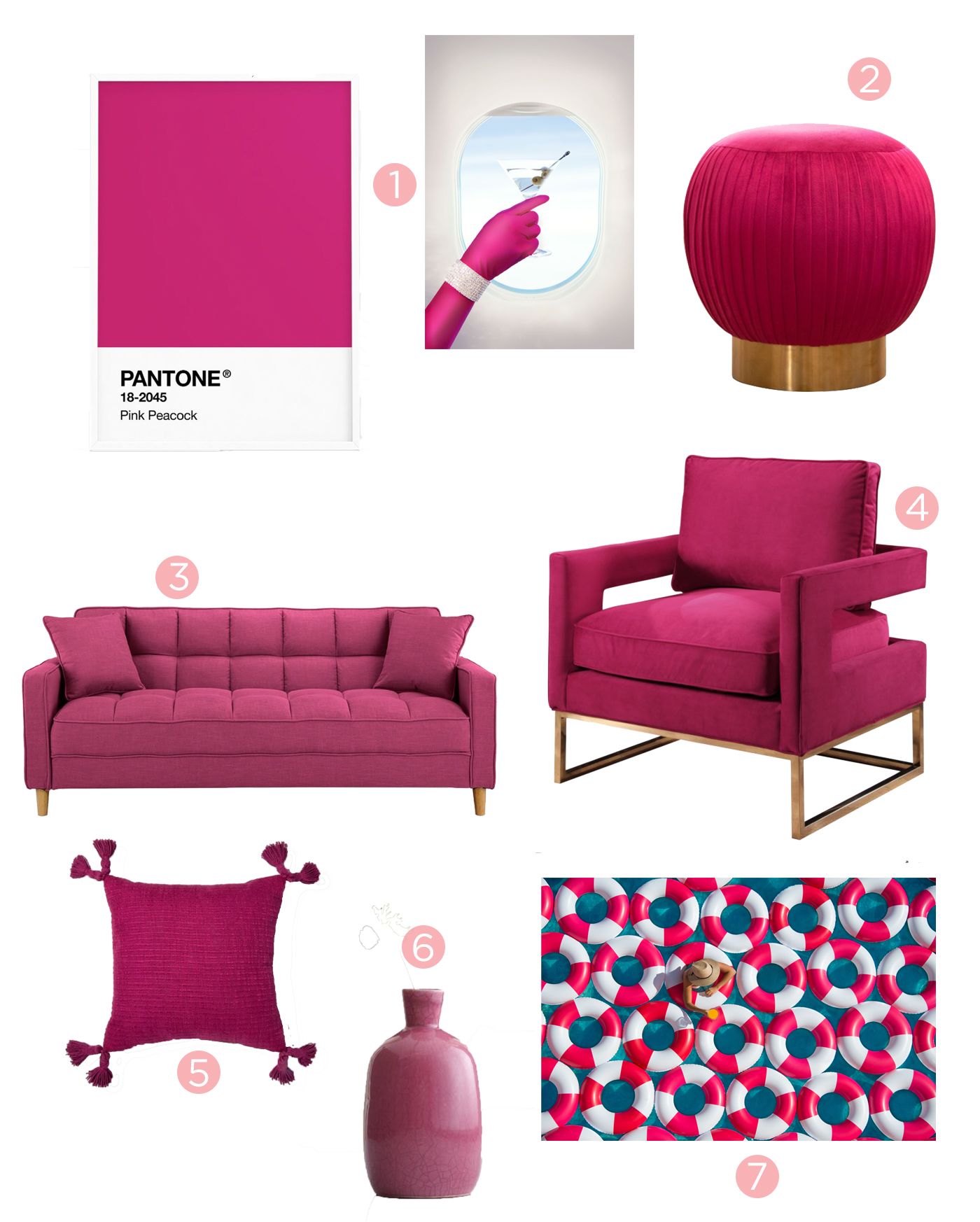
- The Blonde Print | 2. Pouf | 3. Sofa | 4. Velvet Armchair | 5. Pillow | 6. Vase | 7. Poolside Aperitif Print
You don’t have to turn your space into a Barbie Dream Home to incorporate a little pink into your décor. Go for a statement making piece like this sofa or geometric armchair or opt for a subtle addition to your décor with a pretty ceramic vase. And if you are feeling a little extra glamourous, we love this print of an iconic pink-loving blonde for a little pop of luxury.
Turmeric


- Valet II Print | 2. Chair | 3. Ottoman | 4. Throw Blanket | 5. Vase | 6. Rug | 7. Orange Square Print
We’re loving this bright orange print as the perfect way to transition your home décor from summer to fall. Go for a rustier tone like this ottoman or vase, or embrace the bold turmeric hue even in a more subdued print like Gray’s Valet II. To avoid looking too Halloween-happy, pair this shade with more muted neutral tones to keep things color-appropriate all year round.
Pepper Stem


- Faux Chestnut Branch | 2. North Avenue Beach With Lifeguard Boats Print | 3. Pillow| 4. Sofa | 5. The Touch-Up, Beverly Hills Hotel Print | 6. Chair | 7. Rug
Looking for an earthy feel that won’t require you learning how to keep plants alive? Try out this fresh green tone on everything from your rug to yoursofa, or add in just a touch of Pepper Stem green to a tall vase with a faux chestnut branch like this one. We love the range of décor styles this color suits, since it’s equally captivating in glamourous prints inspired by Hollywood as it is in beachy lake aerials.
Aspen Gold


- Bananas I Print | 2. Floor Lamp | 3. Pillow | 4. Chaise | 5. Table Lamp | 6. Throw | 7. The Queen B Print
Yellow can be an intimidating shade to work into your home, but this soft take on the primary hue will easily complement any space. The buttery undertones make this a great choice for a room that feels a little austere, while adding in a fun print like this bananas image or an homage to a living legend can liven up a room that needs a little extra dose of sunshine.
Which shade is your favorite?
Find even more inspiration on using bold colors in your home décor on our Interiors page.
Xx Team GM
Photos: Gray Malin