Interiors
Design Direction: 3 of Our Interior Designers Dish on How to Get Their Signature Style
byTeam GM
5 years ago
If you’ve frequented the interiors section of our blog, then chances are you’re familiar with the interior design experts behind many of our tips and tricks. (And if you’re not, you can get to know them all here!) To say we value our design contributors would be an understatement, so it goes without saying that we are pretty obsessed with each of their interior design styles. If you’ve ever had the urge to hire a professional to design your space, but maybe don’t have the resources at the moment, then you’ll be glad to hear that today we’re letting you in on a few secrets… Or in other words, three of our designers are dishing about how to get their signature design style, right in your own home. So whether you’re knee-deep in a redesign, just in the beginning stages, or simply dreaming up some interior design inspiration, you’ll want to keep scrolling…
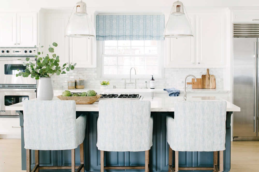
Kate Lester of Kate Lester Interiors
Shop: Kate Lester Home
Instagram: @klinteriors

What would you consider your “signature style?”
If I had to name it, I would say my signature style is probably “Curated Coastal.” That actually has a really nice ring to it, I may trademark it later. This means lots of crisp whites, moody blues, and lots of natural and reclaimed wood. I am a beach girl at heart, but my signature style is about infusing that vibe into my designs in a less literal, and more thoughtful/unique way. I really gravitate toward coastal elements that tell a story. Instead of using coral and seashells, give me ALL OF the vintage sail cloth, abstract landscapes, and vintage accessories. We keep everything feeling fresh by adding in more modern photography and pops of seaglass, bone and driftwood.

Can you share a go-to design trick you use on the regular?
If you are hoping to get that Kate Lester “Curated Coastal” look in your own home, get ready to dumpster dive! I am kidding, but definitely learn to love a good flea market and antique store. Finding new ways to infuse old things is my jam. Also, when you are decorating, find your “weird thing.” In every space we create we always add in at least one pop of wow-factor or a conversation piece. Find that for your room, and run with it!

And of course, we have to know your fave Gray Malin print to use in your designs…
Most recently for us, it was a custom square version of Gray’s Bathing Beauty. She is simple and structural, but also moody and chic!
.jpg-bKOQfGw)
Prudence Bailey of Prudence Home + Design
Instagram: @prudencehomeanddesign

What would you consider your “signature style?”
My signature style is clean, fresh and colorfully comfortable spaces with a blend of modern and classic styles. Glamorous, chinoiserie and coastal chic twists are often found in my designs.

Can you share a go-to design trick you use on the regular?
I love ginger jars! Put some branches or Monstera leaves in one and instantly your space will feel fresh and chic.

And of course, we have to know your fave Gray Malin print to use in your designs…
My favorite GM photograph is the Castle Hill Lawn in Newport, RI. We spend our summers in Newport and have enjoyed many beautiful sunsets and days with friends and family on that lawn.
.jpg-r_iYSrc)
Dee Murphy of Murphy Deesign
Instagram: @murphydeesign

What would you consider your “signature style?”
My signature style is a bit tough to nail down... BUT... I would say it’s an eclectic mix between traditional and modern. French eclectic? Let’s go with that.

Can you share a go-to design trick you use on the regular?
The best tip for achieving my style is to mix vintage pieces with modern pops (and I usually add the modern pop through my lighting)! Case in point—this ridiculously stunning light fixture (below) I used in my otherwise classic kitchen for the Spring 2019 One Room Challenge. I sort of broke design “rules” here by putting a flush mount on my kitchen ceiling (instead of a pendant)... and it works so well for two reasons! 1) The kitchen is small, so a pendant takes up too much visual space (in every photo, it would be blocking something else). 2) This flush mount draws the eye to the gorgeous ceiling and illuminates it in the most beautiful way!

And of course, we have to know your fave Gray Malin print to use in your designs…
My favorite print from Gray is Always Welcome At The Parker II, because our son (Parker) was conceived at the Parker Palm Springs!I love that it holds sentimental meaning to us as a family, while also being a really chic and fun piece of artwork.

Are you as smitten by these interior designers as we are?
For more interior design inspiration, make sure to give our designers a follow on each of their Instagram accounts listed above, and keep your eyes peeled on the blog for more advice from them in the future…
Xx Team GM
Photos: Lauren Pressey Photography for Kate Lester, Katie Tenboer for Prudence Bailey, Zeke Ruelas for Dee Murphy